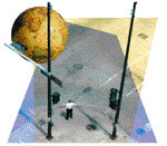
Checking China for Unusual Lumps
October is National Breast Cancer Awareness Month. Time Magazine, in their October 15, 2007, issue, illustrates the global breast cancer crisis.

Click on this site and help fund free mamograms.

Stamps, postcards, advertising, coffee mugs, shirts, and other ephemera. I love maps, and maps as an element of design.
"I think that the constant study of maps is apt to disturb men’s reasoning powers" -- Lord Salisbury

2 Comments:
I was looking for an email addi but thought tucking this comment back in the archives the reasonable alternative.
By way of constructive criticism might I suggest that you don't display a 400px wide image as 500px. It looks awful. The same goes for larger images - if you have a pic that is 750px wide, it's better to upload it after reducing the size, otherwise the compression artifact can really spoil the appearance. As an alternative, upload it twice, displaying the smaller one in the entry and linking through to the bigger one.
I'm no expert but displaying images is my stock in trade and I have spent an inordinate amount of time trying to balance off competing technicalities.
Anyway, just a thought --- if there is anyone else out there with similar sensibilities to mine, they will tend to partly judge the worth of a site on so important an issue as the quality of the eye candy presented, especially when it is cartophilic in nature. Good luck with it all anyway.
hmmm... I appreciate your feedback, tho I'm not sure I understand what you're describing. As far as I can tell, I AM doing what you suggest. I'm not doing what you describe to the image on this page... Can you give me a more specific example?
Also, I have contact info under the FAQ at "Caveats, Disclaimers and Contact Info"
"Send an email to "admin" at this domain."
I'm not going to spell out the address, as it only invites spam... but I assume you can sort it out...
Post a Comment
Subscribe to Post Comments [Atom]
<< Home